
Not a secret we often create new brands from scratch. If you missed the use-case of reklaminiai.lt and their new branding simply go and check it out here.
Anyway, this time we decided to share a short story about Nampro. It is different because this brand is not new at all. The ones who are in the design and branding industry know how difficult might be to update/rebrand the existing brand. Why is it hard? Mostly because both entrepreneurs and customers are used to the brand, it is easily recognizable. And any redesign of their beloved brand is quite sensitive.
What is Nampro? Nampro is a real estate agency in its eighth year of operation. Do you know what's even more interesting? Nampro was the first one to register and start using Doctor Idea. That's right, meet our first customers!
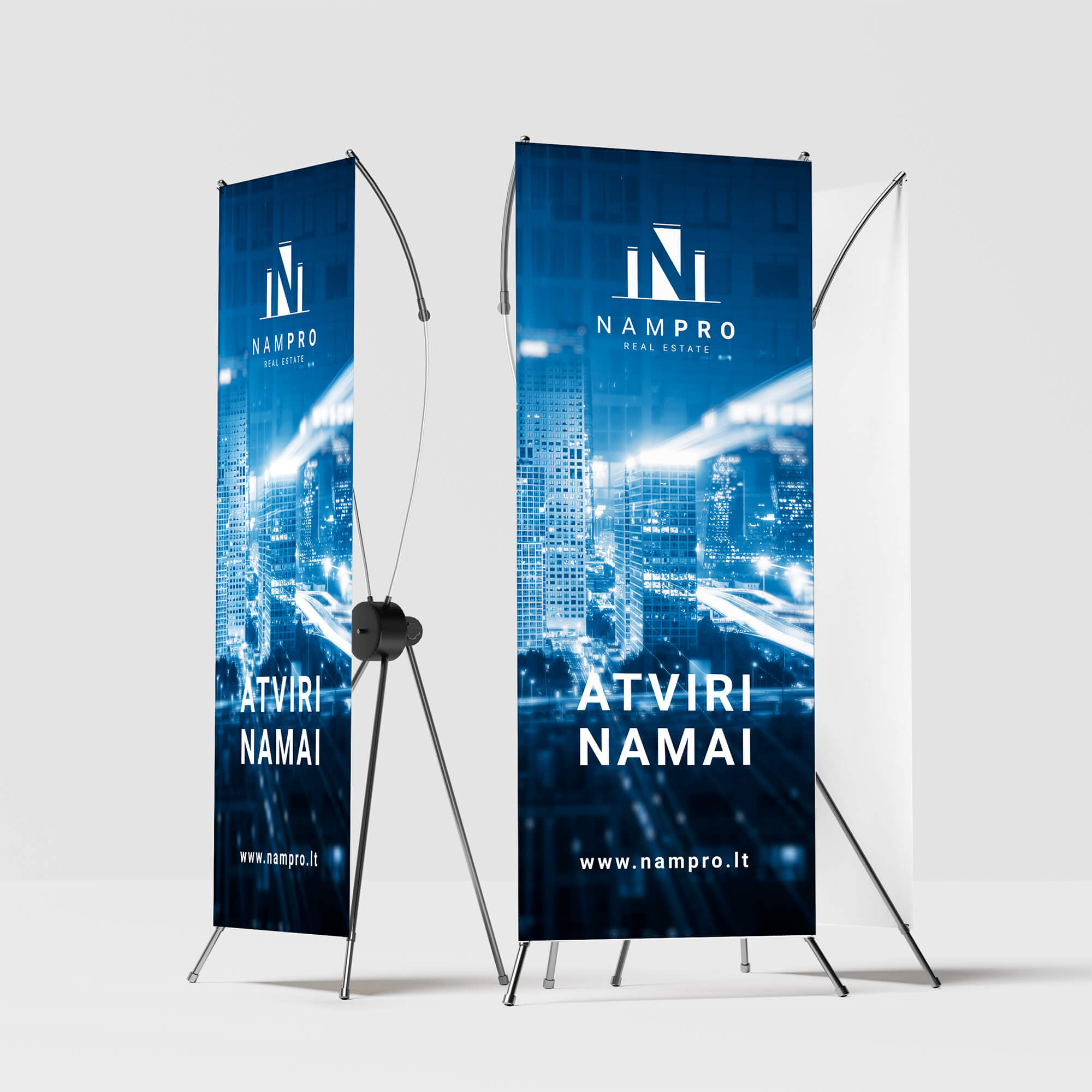
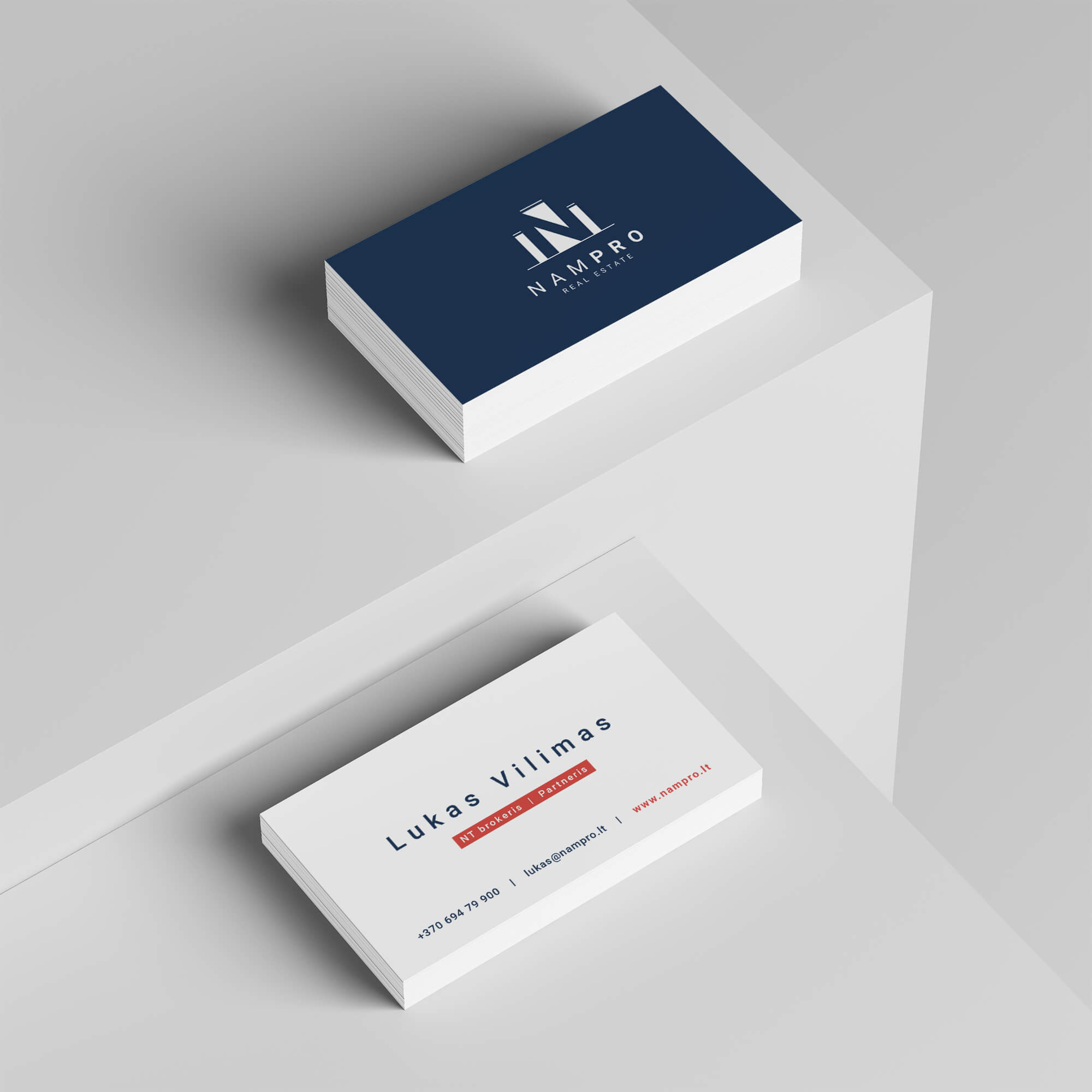
The work started with the rebranding of the brand. Fortunately, there was no big attachment to the old image and logo. As Nampro themselves expressed, their logo “looked like a 92-year-old brand”. It was time to change it to a more modern and minimal look. The new Nampro symbol does indeed show buildings, but by a closer look, you can also see the N-letter tag.
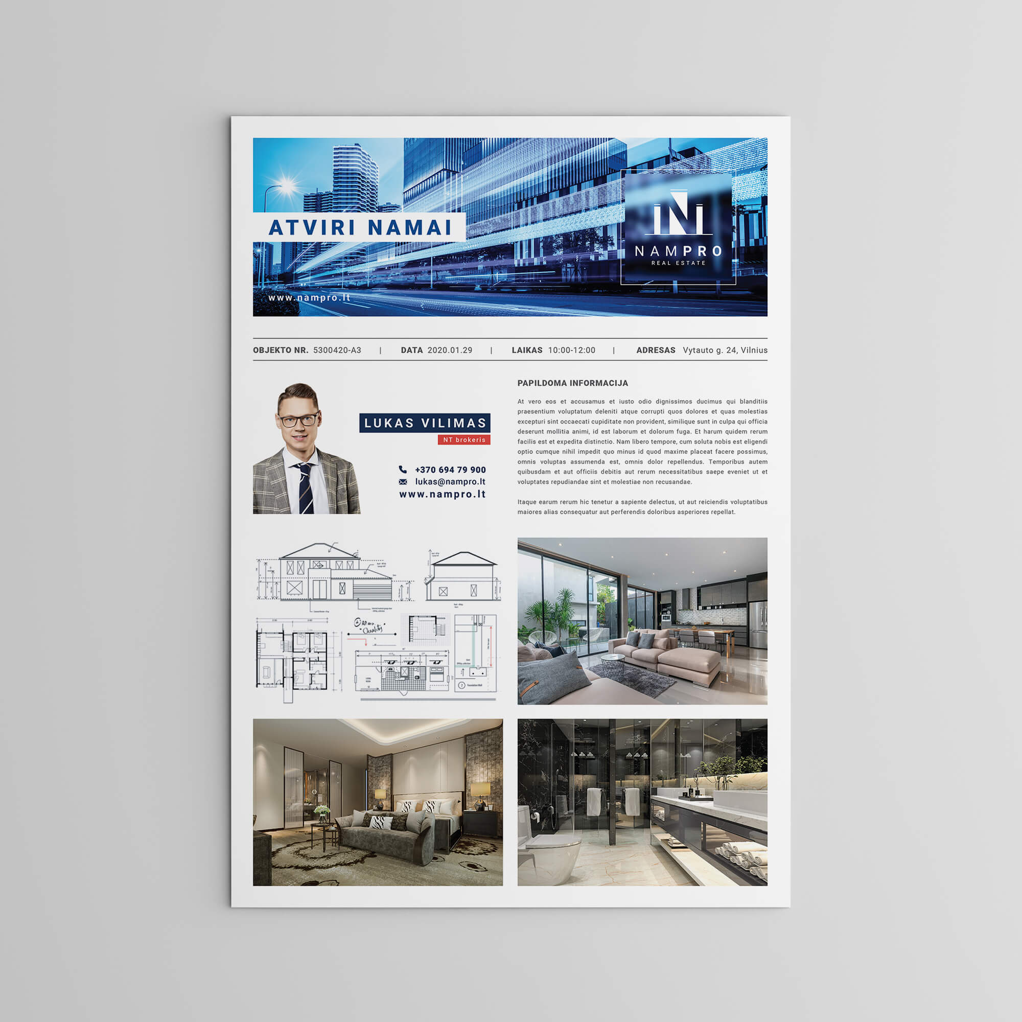
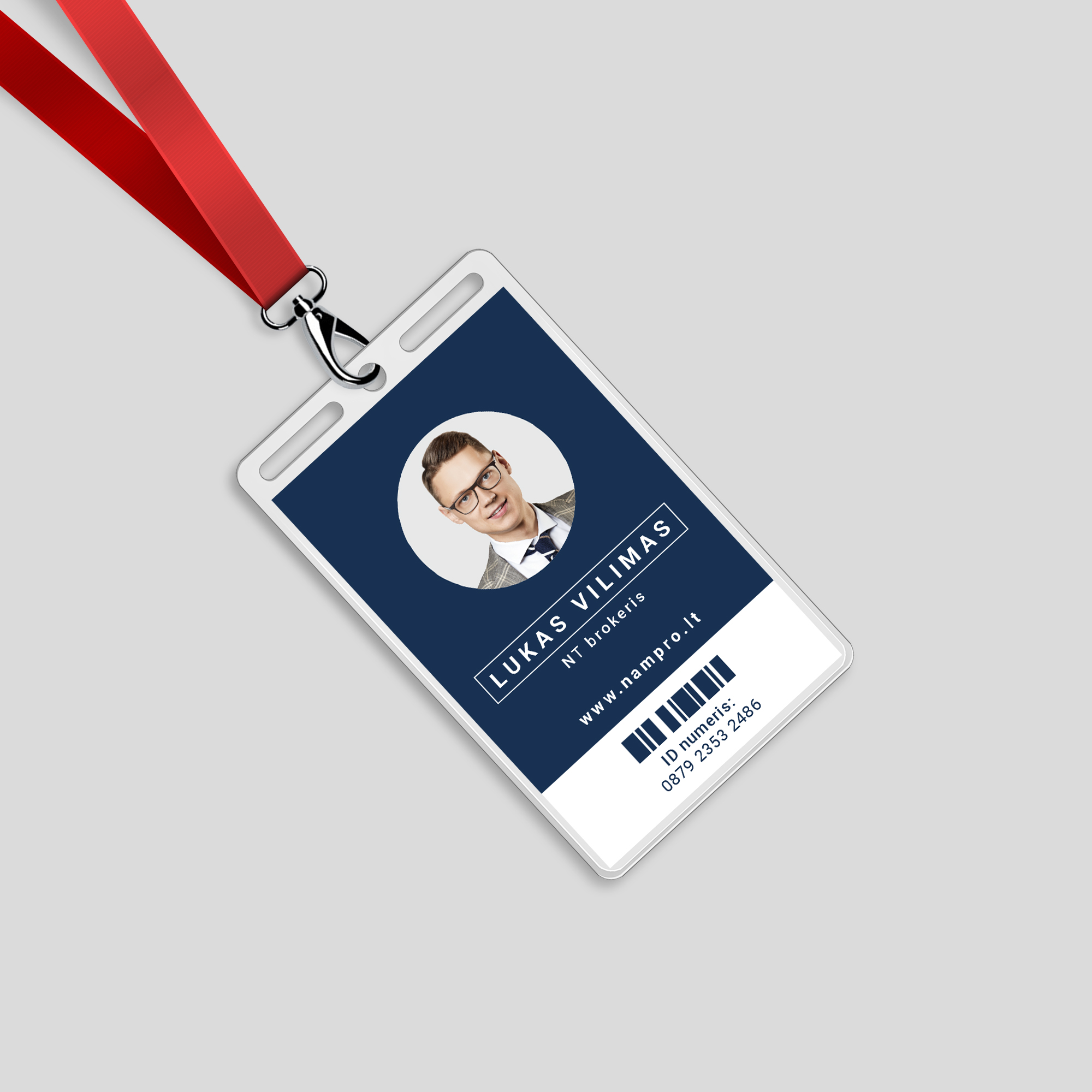
Soon after the rebranded logo, more work followed, ranging from fine promotional merchandise to website communication or social networking. We are not showcasing exactly all here at our blog post, but hopefully from what you see, you can make an overall picture. Nampro has chosen Doctor Idea for a very specific purpose - to rebrand and refresh its visual look image.


By using this website you agree with our cookie policy